Adding New Content
Your DKAN site is an access point for users to connect with open data, but data isn’t the only content type that you can add. There are a variety of content types at your disposal, and it’s up to you to choose which best suits your needs.
Content Types in DKAN:
Dataset
Datasets are used to group related pieces of data and their associated metadata. These pieces of data - known as Resources - can then be found under a single url along with descriptions and licensing information.
You can think of Datasets as ‘folders’ for the Resources within. In real life, a typical folder could contain a printed spreadsheet, a PDF of a map, and a CD-ROM within it. In DKAN, you can similarly add a wide number of Resources in various formats to a single Dataset.
Datasets are assigned to Groups, which helps sort Datasets according to a common publisher. For more on Groups, see below.
Admins, Site Managers, Editors and Content Creators can all add Datasets.
Resource
In DKAN, Resources are the files, APIs or links that are being shared within a Dataset.
Resource types include csv, html, xls, json, xlsx, doc, docx, rdf, txt, jpg, png, gif, tiff, pdf, odf, ods, odt, tsv, geojson and xml files.
If the Resource is an API, it can be used as a live source of information for building a site or application.
Resources can be previewed within your browser in the form of a grid, graph or map using DKAN Data Previews or used to create visualizations.
Admins, Site Managers, Editors and Content Creators can all add Resources.
Group
Groups allow you to group together Datasets under a organization (i.e. Department of Transportation, Department of Education) in order to make it easier for users to browse Datasets by theme.
As a best practice, Datasets and Resources that are added to a Group should share a common publisher.
Groups also enable you to assign roles and permissions to members of the group. By adding users to the Group’s membership roster, you can create and manage a community based around the data within the group.
Groups may be added by Admins and Site Managers, but not by Editors or Content Creators.
Page
Pages are used for static content, such as an “About” or “FAQ” page. They may be added by Admins, Site Managers and Editors, but not by Content Creators.
Data Story
Data Stories are used for creating blog-like content pertaining to data over time. A real life example would be monthly Data Stories created by the Parks and Recreation Department to use charts and maps to update site visitors on a local tree-planting campaign.
Much like Data Dashboards, Data Stories offer a wide range of possible layouts and can be curated with data visualizations like charts, maps and tables.
Admins, Site Managers, Editors and Content Creators can all add Data Stories.
Data Dashboard
The Data Dashboards feature allows you to create pages that bring together various forms of content about a specific subject all in one place.
A real-life example of a data dashboard can be found on any major weather site when looking up the charts, maps and tables from a specific zip code.
Admins, Site Managers, Editors and Content Creators can all add Data Dashboards.
Harvest Source
A Harvest Source is a content type that allows administrators or Site Managers to “harvest” data from outside sources. To “harvest” data is to use the public feed or API of another data portal to import items from that portal’s catalog into your own.
Harvested datasets are fully imported from an external source onto your DKAN site. This means that the datasets exist both on the external source and your site - independently from one another, and with all of the same information (including title, metadata, tags, and so on.)
By importing datasets from external sources, you can provide more open data on your site without manually managing the dataset content itself. Site visitors will see that a dataset was harvested and its original source, promoting visibility across agencies and sectors.
Admins and Site Managers can add Harvest Sources, but not Editors or Content Creators.
Visualization
Visualizations provide intuitive, understandable displays of data. Visualizing information fulfills a basic need; the need to tell a story.
Visualizations allow users to understand the data from a new perspective, and can be viewed within the site or embedded elsewhere without having to download the data itself. This not only saves time, but also saves memory, bandwidth and hard drive storage space.
Currently, Charts are the only Visualization type included within out-of-the-box DKAN, but Maps are underway in the future.
Admins, Site Managers, and Editors can create Visualizations, but not Content Creators.
Where do I add new content?
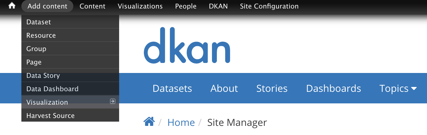
The Add Content menu
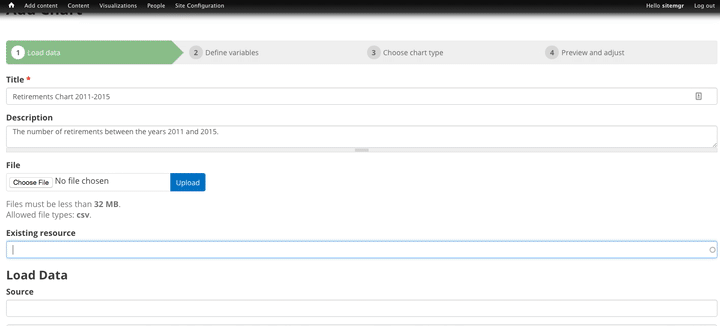
The most direct path for creating content is through the Add content tab on the Admin Menu toolbar. Select the content type you’d like to add, then complete the fields shown in the following form.
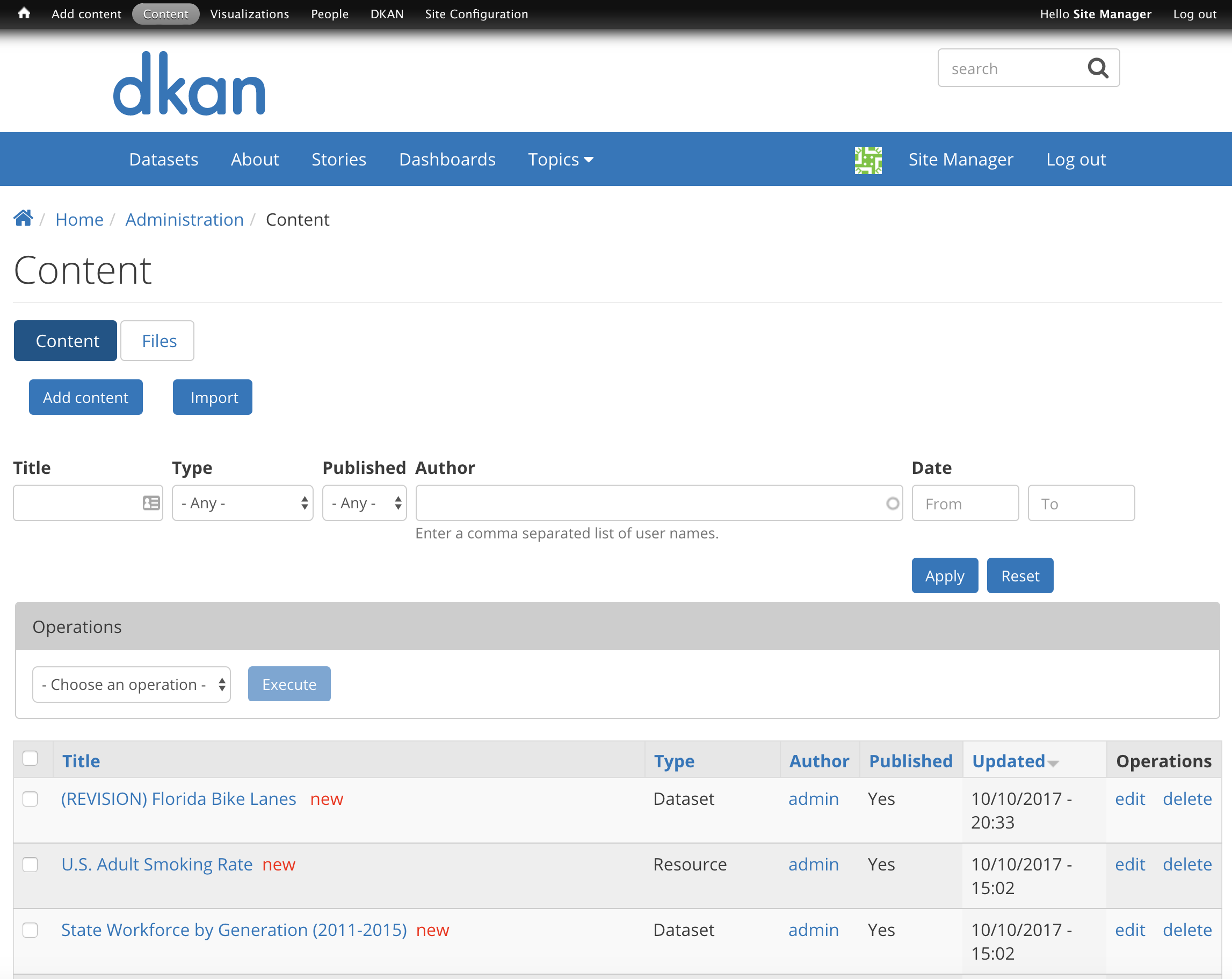
The Content Page
In some cases, you may want to see what content exists before creating something new from scratch. As your site grows, it’s helpful to check what already exists before starting something new.
You can click Content from the admin menu to access the Content page and view all existing content, publish or unpublish content, and add new content from scratch.
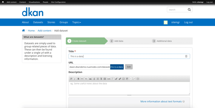
In the example below, the user is adding a new Dataset with Tags, Topics, and other metadata associated with Datasets.
Though not all fields in the Dataset creation form are required, it’s best to include as much information as possible. This way, users and the general public will have the proper metadata.
The final step in creating a piece of content is using the submenu at the bottom of the form to add the administrative information to the content.
Use this menu to add information about:
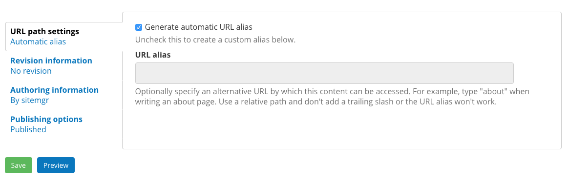
URL path settings: By default, the “generate automatic URL alias” option is selected because DKAN is designed to provide the most intuitive and SEO-optimized URL path. To create your own path, uncheck the box and type in a new alias.
Revision information: This information is important for content that has been added and then edited. By checking the “create new revision” checkbox, DKAN will create a revision of the content.
Revisions can be helpful if a change is made and published and later you want revert to an old revision. Include notes about the changes in the Revision log message text box to give other users context.
Authoring information: In DKAN, content must be assigned to an author and given an authoring date so that it can be managed later even if the author is the Anonymous user. An author must be a user on your DKAN site, and this is helpful in knowing which users have added specific pieces of content. By default, DKAN assigns the author to the user who is logged in when the content is added.
If you leave the “authored on” field blank, DKAN will use the date and time of when the content was originally saved.
Publishing options: Authenticated users who have created or have the right to modify site content can publish and unpublish content. Published content is saved and visible on your DKAN site. Unpublished content is saved, but it is not visible on your DKAN site.
Why unpublish content? The “unpublish” option is helpful for when content should be saved as a Draft, or archived but not deleted. Deleting content permanently erases it, so the “unpublish” option allows you to retain content that is no longer published live.
Groups: While Datasets are the “folders” for data resources, Groups are the container for those folders. Resources cannot be added themselves to a Group, they must be stored within a Dataset to be associated with a Group.
For example, the Dataset “City Bike Lanes” would be associated with the group “Department of Transportation”
Datasets can be added to multiple Groups. All users must belong to at least one Group to have the Groups menu item available to them.
When a Dataset is added to a Group, it will be included on the Group’s home page and may be edited by the Administrator members of a Group. As a best practice, users should only add Datasets to Groups they are a member of.
Viewing content you’ve already uploaded
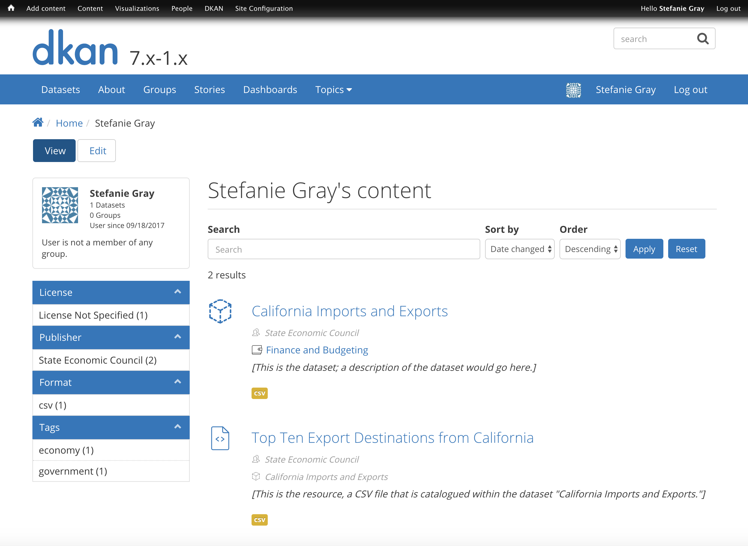
To see a list of content that you’ve already uploaded, you can navigate to your user profile page by clicking on your username on the right-hand side of the screen.
Once you’re on your user profile page, you’ll see a list of datasets, resources and other content types that were uploaded by your account.
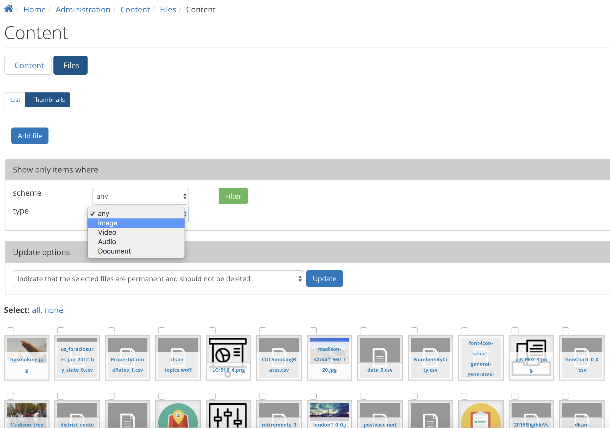
Viewing a listing of the site’s files
From the admin menu, click “Content.” Once you’re on the Content page, the “Files” button will take you to the files listing.
Adding a Resource
There are three ways to import a resource to your DKAN open data catalog:
- Upload a file: Select the file from your hard drive or local network, then click “Upload.”
- API or website URL: Provide the link to an outside API or website URL to add it to your DKAN data catalog as a resource.
- Remote file: You can import a file hosted elsewhere on the Internet, provided it is in a format supported by DKAN. (File formats are listed on the “Add Resource” screen.)
CSV files, once added as a Resource, can then be imported to the DKAN Datastore for efficient storage and access. (recommended).
Steps to upload a new resource
- From the Admin Menu, hover over the Add Content menu link.
- On the drop-down menu, select the Resource option.
- Choose a method for uploading the Resource (upload, API/website, or remote).
- Enable Data Previews such as Grid, Graph or Map (optional). Also, select the appropriate delimiter, and choose whether your Data Previews should have an option to be embedded elsewhere.
- Give the Resource a title (required), a description (optional), and add to a Dataset (optional).
- Click the Save or Save and add another button at the end of the form to add the Resource.
It’s possible to add a Resource as a stand alone piece of content, but it isn’t recommended. As a best practice, and for optimal site organization, all Resources should be added to Datasets.
Otherwise, Resources on their own do not contain metadata – which is why it’s important to assign them to Datasets, which do have metadata. Resources also inherit the group association of the dataset they belong to.
When adding a new Resource, DKAN provides a list of existing Datasets and you can select the appropriate one. If none of the existing Datasets are a good fit, then consider first adding a new Dataset. You can also add a Resource and then assign it to a Dataset at a later time.
Enabling Data Previews
As site visitors browse through a Dataset and its Resources, they can click the Explore Data button to preview a specific Resource.
DKAN’s built in Data Preview tools give site visitors the option to see a basic visual of a Resource as a map, chart, or grid.
Users uploading Resources can enable DKAN Data Previews on JSON, geoJSON, XML, ArcGIS REST, WMS, image, PDF, and ZIP files. The options are provided as three checkboxes during the process of uploading a Resource.
Data Previews only display if the contents of the Resource match the data format for a preview. For example, if the map preview is enabled but the Resource doesn’t have latitudinal/longitudinal or GeoJSON data, then the Preview page will be blank.
This image displays where you can enable grid, graph and/or map previews for a Resource.
Data Preview Types:
Grids and Graphs: This type of Data Preview works well with tabular data like CSV or XLS files. Grids appear most similar to a spreadsheet.
Graph previews allow site visitors to select the values from the data that may be plotted as a column, bar, line or point graph.
Maps: If the resource contains a Latitude column and a Longitude column (in decimal values - see http://www.earthpoint.us/Convert.aspx), then each record from the data will be displayed as a point on the map. Site visitors can click each point to learn about the data.
External Previews:
Need to use advanced data visualizations from an outside source? Use DKAN External Previews.
ArcGIS, CartoDB, Infogram and Tableau, as well as other outside data viz tools can all be embedded within DKAN Data Stories and Data Dashboards, as well as on Pages.
Additionally, External Previews can be used for ArcGIS and Carto previews of data resources - directly on the resource’s page.
Once External Previews are enabled, site visitors can view a Resource and click the Open With button to visualize the contents of the Resource with an External Preview.
Choose which visualization tool is best for previewing a Resource based on its data format.
For Admins: How to enable External Previews:
- On the Admin Menu, hover over the DKAN menu link until the drop-down menu appears.
- Select Data Previews.
- From the Data Previews page, scroll down to the section titled External Preview Settings.
- In the External Preview Settings section, check the box for the External Previews you want to make available for viewing a Resource.
- If a data format is not listed in this section, you can add the data format to the list of available formats for Resources.
There are two types of External Previews that may be enabled by Site Managers: CartoDB and ArcGIS.
Carto Preview: CartoDB is an open source platform with a powerful datastore that allows users to create their own maps using Carto Builder.
Supported formats: CSV, Excel, GeoJSON, KML, OpenXML, XLS
ArcGIS Preview: ESRI ArcGIS can be used to create multi-dimensional maps (such as the topography of a mountain range, or the flow of a watershed) and does not limit the amount of layers you can add to your map.
ArcGIS Previews require a URL in the resource API field and will not work with Resource files.
Supported formats: ArcGIS endpoints, SHP files (shapefiles)
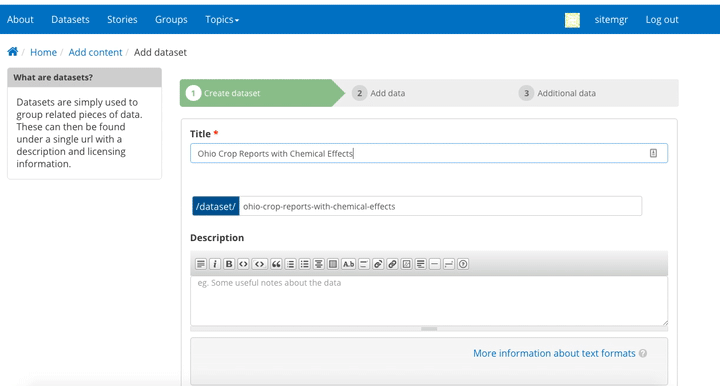
Adding a Dataset
Remember to include as much metadata (the who, what, when, where and why of data) as possible in order to give site visitors context.
Add a Dataset:
- From the Admin Menu, hover over the Add Content menu link and select Dataset.
- Add a title, description, Tags, contact information and public access level (required). Optionally, Datasets may be added to Groups and assigned Topics.
- Add a license to clarify reuse limitations.
- Click the Next: Add data button to add at least one Resource.
- Follow the steps for adding a Resource.
- Click the Save button to finalize the addition.

This animated screencap displays the process of editing and saving a dataset.
Directly under the title of the Dataset, you may change the URL path for your dataset in the dataset/ field. Note that the title and URL path are not linked. That means that you can change the title without affecting the URL path and vice versa.
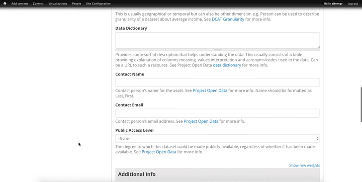
Adding Metadata
Metadata is the “Who, What, When, Where, Why” of data. Metadata contains the attributes that describe each Dataset. Examples include the name of the Dataset’s author, the title of the Dataset, the date that it was last updated, any relevant contact information associated with the Dataset, and more.
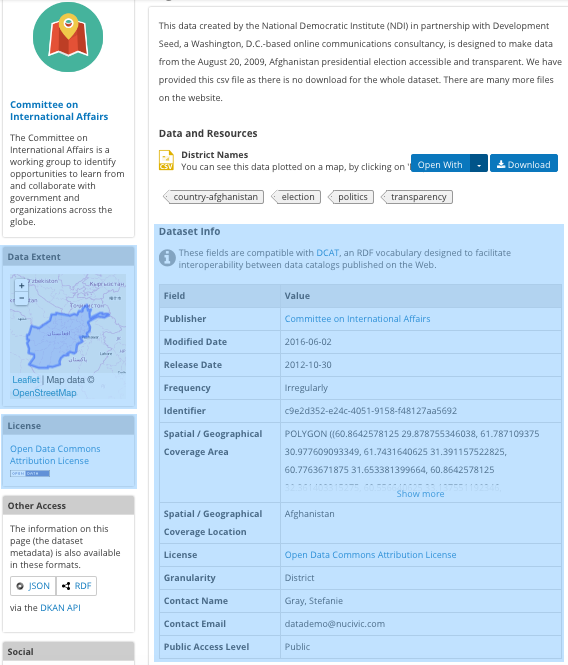
When viewing a Dataset, you can scroll down the page to the “Dataset Info” section to view its metadata.
In addition to providing important context, metadata makes the data published machine-readable. That means that programmers, analysts and other technical users can use the information for their own purposes.
Though most metadata fields are not required, adding more detail to your metadata will make for more usable datasets. In some cases, extra metadata fields are required to be compliant with certain standards and initiatives.
The fields included in the Additional Info screen are the metadata for the Dataset and are compatible with DCAT, an RDF vocabulary designed to facilitate interoperability between data catalogs published on the web. These fields are also compatible with the Common Core metadata schema from Project Open Data.
Site Managers can select to make Project Open Data and DCAT fields required for publishing a Dataset by enabling POD and/or DCAT validation.
When viewing a Dataset, scroll down the page to the Dataset Info section to view its metadata.
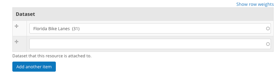
Adding more relevant information: In the image below, you can see a section titled Resources and below that Related Content. In the Resources section you can choose from existing Resources to pull into the Dataset. You can even choose the order Resources appear in by dragging the individual rows up and down. Click the Add another item to add as many Resources as you want to the Dataset.
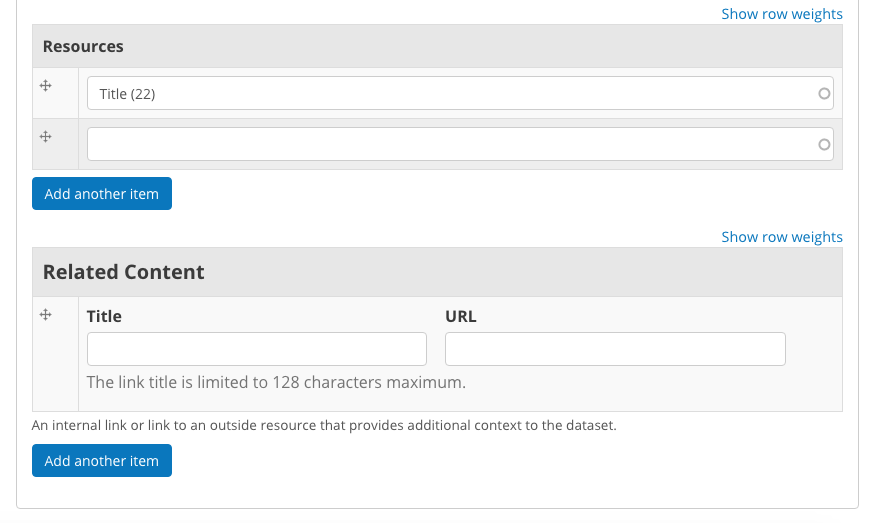
Scroll to the Related Content section to add links to other content that site visitors should see. This is a great way to link to your Data Stories, Charts, and Dashboards (or external links) that showcase the impact that data can have on the daily lives of citizens.
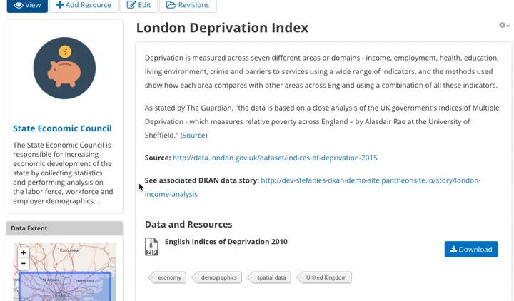
Below is a Dataset that has been filled out completely with a description, metadata, assigned to a Group and includes related content.
Visualizations
Visualizations take Resources on your DKAN site and generate visual representations to make data understandable and accessible. DKAN offers several built-in tools for making data visualizations easy. These were designed with ease of use and flexibility in mind.
A Chart is the means, but the end must be defined by the citizen need. What is important for the site visitor to know about the data? What can we learn by comparing the different information contained in a single Resource? Once a Chart is added you can feature it to support the narrative of a Data Story or complete a Data Dashboard.
While this tool is incredibly powerful, it also includes more variables that depend on one another. As a Site Manager, you have access to create Visualizations on DKAN. This type of content is unique to Site Managers and Editors, and as a Site Manager you have access to manage all content regardless of the author.
Adding Charts
In general, you’ll add DKAN Charts for your visualizations. Charts are a powerful tool for taking data and making it meaningful to the average site visitor who may have little to no experience with data and analysis. Charts offer power and flexibility to represent exactly what you’re looking for with minimal effort and no specific technical training required. Data that power charts can come directly from your DKAN data catalog or alternatively any URL, public Google spreadsheet, or data proxy/API.
Charts are ideal for showing comparative and/or historical information. Site visitors can look at a Chart and quickly discern the relationship between several data points. Charts easily adapt to represent a number of combinations between many values. Visualizations may range from a simple 2-dimensional comparison to more complex, multi-faceted relationships.
Supported data and file types:
- Using internal CSV files: Charts visualize data that has its contents organized into rows and columns (tabular data). DKAN Charts support CSV files when selecting an internal Resource hosted on DKAN. Select the CSV option for the back-end when loading the data source.
- External CSV and XLS files: You can create a Chart from files hosted elsewhere on the Web as long as a link is provided. Linked files can be a CSV or XLS. When files are externally linked select the DataProxy option for the backend when loading the data source.
- Using Google spreadsheets: Public Google spreadsheets are files created with Google sheets that have been published to the web. You can create your Chart with the public link and by selecting the Google spreadsheet option for the back-end when loading the data source.
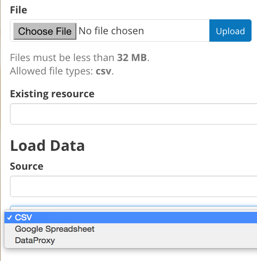
Choosing your data: The first step in adding a Chart is choosing which data you want to visualize. Choose a title and add a description, then select the data source. You have a 3 options for selecting the data source:
- Upload a new file: This is a file stored locally (ie a file on your computer’s hard drive) and not already on your DKAN site. Uploading a file to power your Chart does not automatically add the file as a Resource on your DKAN site. Use the Upload button in the File field to choose a file from your computer. Note file size and type limits apply.
- Choose an existing Resource: Select a Resource that has been added to your DKAN site. Start typing in the Existing Resource field and DKAN will autocomplete with matching Resources.
- Link to an external file: Use the Source field to link to a file hosted elsewhere on the web.
Choose a data processor: Once you select the data source, it’s important to choose the right data back-end to process the data. The processor reads the contents of a file and makes it possible to define which variables should be visualized. This works in the background, but you should know which data sources match which data back-ends. There are 3 data back-end to choose from:
- CSV: CSV is the default selection, and it is used for Charts powered by internal data sources. If you upload a new file or select an existing Resource as your data source then your data back-end is CSV.
- DataProxy: If you use an external link for the data source, you may use a CSV or XLS file type. An external link is the only way to power a Chart with an XLS file. If you select a data source by using an external link then your data back-end is DataProxy.
- Google Spreadsheet: You can power a Chart with a Google spreadsheet if the document has been published to the Web and made public. If you select the public link to a Google spreadsheet then Google Spreadsheet is your data back-end.
Defining your Chart variables: In essence, Chart variables are the two axes of your Chart that you set. The x-axis and the y-axis each have their own set of values that run along each respective axis. Because Resources often contain more than two columns (all with their own set of values), you can choose which columns you want as the x- and y-axis as well as add Series. Series can be selected from the different columns within your Resource to compare multiple columns along the Chart axes. This provides flexibility when using large files to create Charts.
You can choose which contents within the data source to display on your Chart. Some data sources may be fairly simple with only a couple columns while others may contain dozens. Options for the variables are based on the contents of the data source selected to power your DKAN Chart, so you’ll choose from columns and their values. There are 3 variables to select for when adding your Chart:
- Series. Series show the values within a column as the y-axis values mapped along the X-Field values. Once you choose a column to provide the values for the X-Field, Series provide the corresponding y-values. You can choose multiple columns from your Resource to be Series, which can be helpful for showing multiple data points next to one another.
- X-Field. The X-Field provides the x-axis values for your Chart. Choose a column from your Resource to populate the X-Field with values.
- Data Format: Selecting the correct data format helps Charts to display correctly. Choose the format that matches the format of the values in your X-Field. If you’re not sure, you can leave the selection on Auto and DKAN will make the best selection. If the values are text/non-numeric, select the String format.
Choose a Chart type: Different types of data work better with certain Chart types more than others. DKAN offers a number of different Chart types like line graphs, bar charts, and pie charts and different types of data will work better as a line graph rather than a bar chart.
For continuous data (like time) use a line Chart to show the movement of the data. For categorical data (like a discrete totals within a category) use bar charts, and for data that totals a sum use a pie chart.
There are a number of Chart types to best display your data depending on what you want the Chart to show and the contents of your Resource. You can choose a Chart type and then move to the Preview and Adjust screen to make the final modifications to your Chart. You can always change the Chart type by using the Back button, so that you can test and see which Chart type works best with your data.
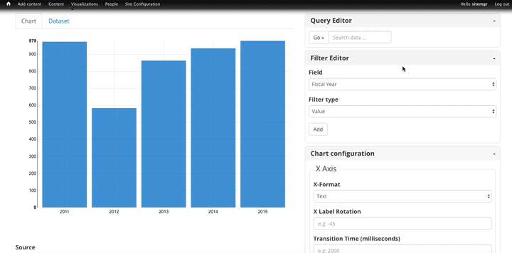
In the example below, the Site Manager is adding a Chart that uses an existing Resource. By typing, DKAN suggests an autocomplete option and the Site Manager selects the Resource. Once the Resource is selected, the Site Manager can define the variables of the Chart. In this example, the Resource is very basic with only two columns that be chosen from, but more robust Resources could have several columns to choose from.
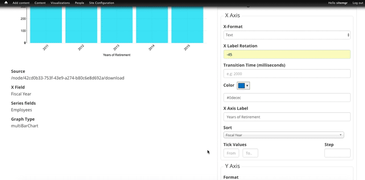
Adjusting your Chart settings: After the data is loaded and the variables selected, you can see how your Chart will appear and make adjustments so that your visualization best depicts the meaning of the data. On the Preview and Adjust screen, you make any final modifications to your Chart through a number of options on the Chart Configuration menu. The Chart preview will adjust in real-time to show you what the Chart will look like on your site. Use the preview to test out different adjustments for your Chart settings.
In the example below, a Site Manager is adjusting the Chart settings for a Chart they’re adding. Though there are a number of options, the data here is fairly basic. The Site Manager rotates the labels by putting in a degree of rotation in the X Label Rotation field, changes the color of bars by adding a hex value in the Color field, and adds a label to the x-axis by putting a name in the X Axis Label field.
As the example continues below, the Site Manager decides to show the title of the Chart and selects the Show Legend option. Show Tooltips and Reduce Ticks are selected by default. Click on the Finish button at the bottom of the page to finalize your selections and see the final results of how the Chart will appear on your DKAN site.
Unlike other content types, Charts don’t automatically collect on a page on your DKAN site. You can make Charts visible by including them in Dashboards and Data Stories.
Key information when adjusting your Chart settings:
- Query Editor: The Query Editor field lets you search the contents of the Resource powering your Chart and visualize the most relevant pieces. This function is useful for especially large Datasets. Use this setting to perform a complex search on the data in your Resource and narrow the focus to display on your Chart. It’s good for highlighting key insights in the data. Use the same format conventions as in the Resource (ie $0.00, x/y/z) when performing the search.
- Filter Editor: Terms add a broad filter to highlight characteristics shared by multiple data points in your Resource. This is adds more focus than visualizing all the contents of a Resource, but is not very overly complex. Use this to draw specific comparisons in your visualization. Add multiple filters to give a specific cross-section within the data.
- Field: Create a term to filter the data by first choosing a Field from a column within the Resource. All the columns will appear in a drop-down menu to choose from. Use terms to narrow the view of the data.
- Filter Type: Choose from the drop-down list to further specify conditions for the data you’re looking for within the Field you’ve already selected.
- X-axis Chart Settings: These settings are specific to the x-axis:
X-Format: Choosing the X-Format lets you specify how the x-axis values are represented rather than as the basic numbers. For example, the value 5.2 will show as $5.20 if the X-Format is $0.00.
- X Label Rotation: Use this to rotate the values of the x-axis of your Chart. With 0 degrees rotation, the labels appear side by side. Enter a number to add a degree of rotation and the labels will appear at an angle.
- Step: Set the number of increments that will appear on the x-axis. The total distance on the x-axis from the 0 value to the final value will be divided into the number of increments set. By default, the Step is not set.
- Tick Values: Set a range of values from your Resource to narrow which values appear on your Chart. By default, every value in the Resource is displayed.
- X Axis Label: This is the name that describes the x-axis and appears on your DKAN Chart below the x-axis. Create a label to provide more context for the data being visualized.
- Y-axis Chart Settings: These settings are specific to the y-axis.
- Format: Choosing the Format lets you specify how the y-axis values are represented rather than as basic numbers. For example, the value 5.2 will show as $5.20 if the Format is $0.00.
- Y Axis Label: This is the name that describes the y-axis and appears on your DKAN Chart below the y-axis. Create a label to provide more context for the data being visualized.
- Distance: The distance of the Y Axis Label from the left edge of the page. The larger the number, the closer the label appears to the y-axis of your Chart.
- General Chart Settings:
- Margin: Margins add padding (extra white space) around your Chart, measured in pixels. Padding is added to the top, right, bottom and left respectively. Adjust the padding to accommodate long labels, Chart values, label rotations, etc.
- Transition Time: Change the time it takes to animate the data in a Chart. Longer transition time will make the sections of a Chart appear more slowly. Note: this does not affect pie charts.
- Color: Change the color of the segments of your Chart by adding color names (blue, green, etc.) or the hexadecimal numbers of specific hues (#FFD9AA , #FFFFFF). You can also use the color selection tool to visually select a color rather than by typing it in. You can add any number of different colors for the Chart segments by adding commas in between colors.
- Sort: Choose which criteria the Chart sorts data by and displays on the graph, like A-Z or highest to lowest. Criteria could be values from the Chart variables or left to the default sort setting.
- Goal: This setting creates a line at the value you designate on the Chart. It signifies a baseline, an average, or a goal among the values to compare the rest of the data. Enter a value in the Goal field to select the value to appear parallel to the x-axis. You can also choose the color of the line, whether you want to show the label (the label is “Target” and cannot be changed), and if the label should appear directly on the chart or outside of it.
- Checkboxes:
- Show title: A Chart must be titled when it is created. By checking this box, you can display that title as a header on the Chart.
- Show controls: Select the Show controls option to make your Chart interactive. On bar charts, you can include buttons for site visitors to choose how data is displayed on the Chart either as Grouped and Stacked. Check this box to show buttons that show data either as a single stack composed of all the Series (Stacked) or the data are grouped together but have discrete bars (Grouped).
- Show legend: When selected, this shows site visitors the names of the Series included in your Chart. Site visitors can show and hide Series on the Chart when Show Legend is checked.
- Group by X-Field: With non-numerical discrete data (usually text), you may have repeated x-values on your x-axis. Check this box to add the outputs together and display as a single x-value on your Chart.
- Show Tooltips: Check this box so that site visitors can mouse over the individual sections of your Chart and see exact values. If this box is checked, you won’t also need Show Values, which creates a fixed label for each value.
- Reduce Ticks: In a value range, you may not need display every value (for example, 1-1000). Check this box to group values by increments to reduce the number of x-axis values shown on the x-axis.
- Stagger Labels: Staggering places labels slightly above and below each other rather than on the same line, so that they don’t overlap. Check this box if your labels don’t appear correctly.
- Show Values: Show exact values on your Chart with a fixed label. If this box is checked, you won’t also need Show Tooltips (which creates hover text with values).
- Show Data Points: This option only applies to the line chart type. Check the Show Data Points option to add a dot on the line Chart for every unique data point in the Resource.
- Donut: This option only applies to the pie chart type. Select the Donut checkbox to change the aesthetic of your pie chart to look like a donut shape. This adds some variety and visual flexibility to the standard pie chart type.
Going back to change Chart selections: To make changes on any of the previous screens, use the Back button rather than the key on your keyboard or back tab in your browser. By moving back without using the Back button, you may lose all your work or encounter other errors.
Adding a Data Story
Similar to a blog post, Data Stories provide a narrative that adds the depth of impact. Stories focus on how data changes real lives every day. While the form might look familiar, it’s helpful to know how the content will appear on DKAN.
- Log in to your DKAN site.
- From the Admin Menu, hover over the Add Content link
- Select the Data Story menu item from the drop-down menu.
- Title the Data Story and provide a banner image
- Add Tags and Topics to make the content easy to find.
- Choose a layout for the Data Story. By default, the most basic layout is selected.
- Click the Save button to create the content.
Once the Data Story is added, the content may be altered, rearranged or new content added using the In-place Editor. Learn more about how to use the In-place Editor.

Key information when adding a Data Story:
- Image: Choose a large, high quality image for your Data Story. This image appears in a large format across the top of the Data Story. Because of the size, you’ll need a large image (minimum 900x1200 pixels) with high resolution so that it appears as expected. In Data Stories, these images can only be uploaded; there isn’t an option to link directly to an image from the web. First select the image by clicking on the Choose file button and then add the image by clicking the Upload button.
- Edit summary: Click the Edit summary link to open another text box. In the Summary text box, you can add unique details about your Data Story. This text appears as teaser text as site visitors browse through the Stories page. If you don’t want to write additional summary text, DKAN will simply pull the first portion of your Data Story in the Body text (about 100 words). Including a summary can be useful in adding more key search terms or using a different tone to intrigue site visitors to learn more.
- Body: This is the section where the contents of your Data Story appear. Because DKAN doesn’t automatically save content and publishes directly to the site once you save, we recommend drafting in a separate text editor so that you can write at your own pace and use your own review process before pasting into the Body section of your Data Story.
- Text editor options: Use the Body text box for the contents of your Data Story. Use the tools in the text editor to format and style the body of your text. With these tools you can add images, links, quotes, and line breaks directly in the text box.
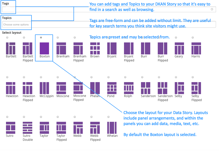
Adding Tags and Topics: You can add Tags and Topics to your Data Story so that it’s easy to find in a search and as site visitors browse the content on your DKAN site. Tags are free-form, so they can be newly added in the field and can contain any words.
Think of Tags as keywords either within or related to the content. So if you have a Data Story about chickenpox vaccines in the state of Mississippi you might include a Tag for “chickenpox”, “vaccines”, “Mississippi” and additionally “public health” and “viruses”. By including Tags on your Data Story, the Data Story associated with those terms will appear when the terms are included in a search.
Topics are similar but distinct from Tags. Topics are preset and they act more as a category that content is collected under on your DKAN site. Topics aren’t limited to a common data publisher or common metadata; they represent a conceptual relationship between pieces of content. As a Site Manager, you can preset which Topics may be assigned to content.
Choosing a layout: Layouts are like templates for the design of a page. In most cases, you would need to have technical experience with code to change the way that content appears on a page and what content is allowed. With DKAN layouts you can choose from a set of layouts pre-made to beautifully combine different content in the same place without needing to touch any code.
Choose the layout for your Data Story and add data, media, text, etc. in the different panels. By default the most basic layout (Boxton) is selected, but choose the layout best fits the types of content you want to include for your Data Story.
Layouts are composed of different regions. Each rectangle and square shown in the different layouts is a region, and each region can contain one or more (or zero) pieces of content. Choosing the right layout is often a matter of trial and error depending on how the content is oriented and how you want it arranged. The regions in a layout are suited better for some content than others; as you add your content you can easily change the layout to meet your needs without losing any of the content.
Adding a Data Dashboard
DKAN Dashboards provide the ultimate flexibility in bringing content together. Layouts are like templates for the design of a page. In most cases, you would need to have technical experience with code to change the way that content appears on a page and what content is allowed. With DKAN layouts you can choose from a set of layouts pre-made to beautifully combine different content in the same place without needing to touch any code.
- From the Admin Menu, hover over the Add Content menu link until a drop-down list appears.
- From the list, select the Data Dashboard link.
- Give the Dashboard a title that is short so that it’s easy for site visitors to search and find.
- Optionally, choose one or more Topics to associate with the Dashboard.
- Give a brief summary of the dashboard in the description field explaining what kind of information it contains.
- Choose a layout that best fits the expected arrangement of the content. Content will automatically be resized to fit the dimensions of the layout. Once a Dashboard is added, the layout may be changed at any time without losing its contents.
- Click the Save button at the bottom of the page to add the Data Dashboard.
Once the Dashboard itself is added, content is added to the layout of the Dashboard in panes. Add visualizations, media, text, etc. to the Dashboard.
Example Data Dashboards can be found on the Dashboards page of demo.getdkan.com.
Layouts for Dashboards and Data Stories
Layouts are composed of different regions. Each rectangle and square shown in the different layouts is a region, and each region can contain one or more (or zero) pieces of content. Choosing the right layout is often a matter of trial and error depending on how the content is oriented and how you want it arranged. The regions in a layout are suited better for some content than others; as you add your content you can easily change the layout to meet your needs without losing any of the content.
Using the In-place Editor: Once you’ve selected the layout and save, you can begin adding content to the regions in the layout using the In-place Editor. The In-place Editor is a drag-and-drop tool that lets you visually place content within your selected layout and see a real-time preview of what it will look like once saved.
- Add ( + ) button: The button to add content is represented on the In-place Editor by a + icon. Click on the + button to add a new piece of content to the region. You can add as many pieces of content to a region as you want. The content will fit to the region of the layout regardless of how many pieces of content are added.
- Style button: The button to add styling to a region is represented by the paintbrush icon in the top-right corner of the region. Use this button to change the style of the region as a whole. That might affect the appearance (like adding rounded corners to the region) or the user experience (like making a region and its content collapsed or exposed).
- Edit button: You might think the Edit button is how you edit the content contained on your Dashboard. This button actually lets you edit the administrative details of the Dashboard. That includes information like the Title of the Dashboard, assigned Topics, authoring information, published status, etc.
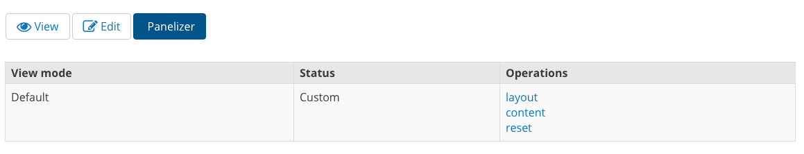
Customize display: Site Managers can change the layout even after adding content to your Dashboard or reset if you want to remove all content. You can also use the content menu to see another view of the content on your Dashboard. This is useful for rearranging content after changing layouts or shifting several pieces of content on a Dashboard. Click on the content link to open another set of options.
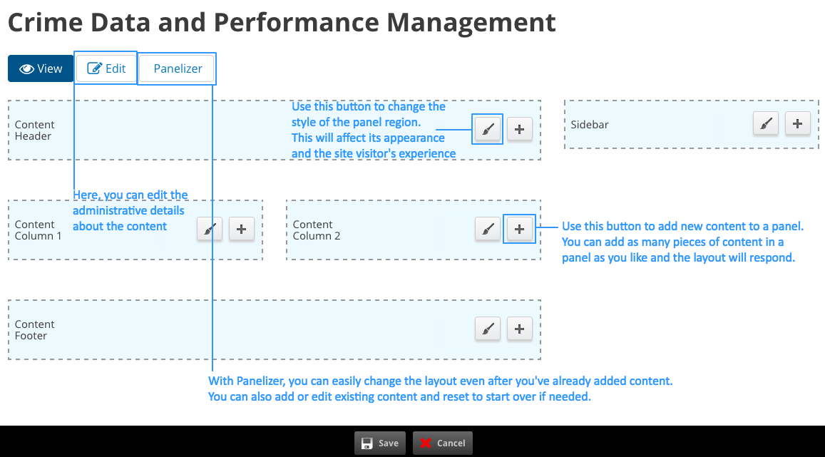
- Title type. The Title type refers to how the title is set. Leave the selection at Manually set for your Dashboard to keep the original title. You won’t change the title of your Dashboard here; this title is added and changed in the Edit menu with other administrative information.
- Substitutions: You won’t need to manage Substitutions, so you can leave this option hidden.
Gear button: On the Customize display screen, you can use the gear icon on the region sections to add and manage content for the whole region as well as change the appearance settings. You can also edit each piece of content within a region using the individual gear icons in the content boxes.
Adding a Page
One of the most basic content types on DKAN is a Page. Though the content type is straightforward it has implications for the structure, appearance, and experience of your DKAN site.
Key Information when adding a Page:
Choosing a layout: Layouts are like templates for the design of a page. In most cases, you would need to have technical experience with code to change the way that content appears on a page and what content is allowed.
With layouts you can choose from a set of layouts pre-made to beautifully combine different content in the same place without needing to touch any code. Choose the layout for your Page and add data, media, text, etc. in the different panels.
By default the most basic layout (Boxton) is selected, but choose the layout best fits the types of content you want to include for your Page. Keep in mind, you can change your layout anytime.
Creating a menu link: The most important piece of creating a page is adding the navigation for it. In order for site visitors to find your page and benefit from its content, add a menu link and decide the parent menu item. For high-priority content, like a Contact page, put the link on the main menu bar. Otherwise, decide which parent page the new page belongs to.
Special note: We recommend that you do not add menu links to the Datasets, Groups, Stories, Dashboards, or Topics pages.
Adding a Group
Groups are both a way to collect common Datasets and enable an additional workflow on DKAN. On the outward-facing side, site visitors are able to browse and search Datasets specifically published by a Group, which is the common publisher of a number of Datasets.
Behind the scenes, Groups add an additional set of roles and permissions that ensure quality and security when publishing your data. Group roles and permissions ensure that Content Creators can add new data but only to their assigned Group. This is especially important for large sites that may have several working groups publishing data to the site. Read more about Group roles and permissions.
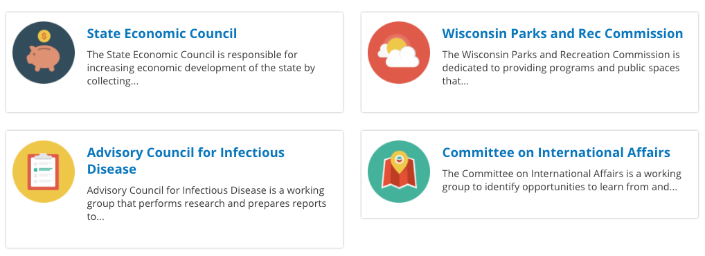
When first adding a new Group, the form has only a few fields. This is the basic information about the Group itself that should tell site visitors what to expect from the Datasets in the Group.
Key information when adding a Group:
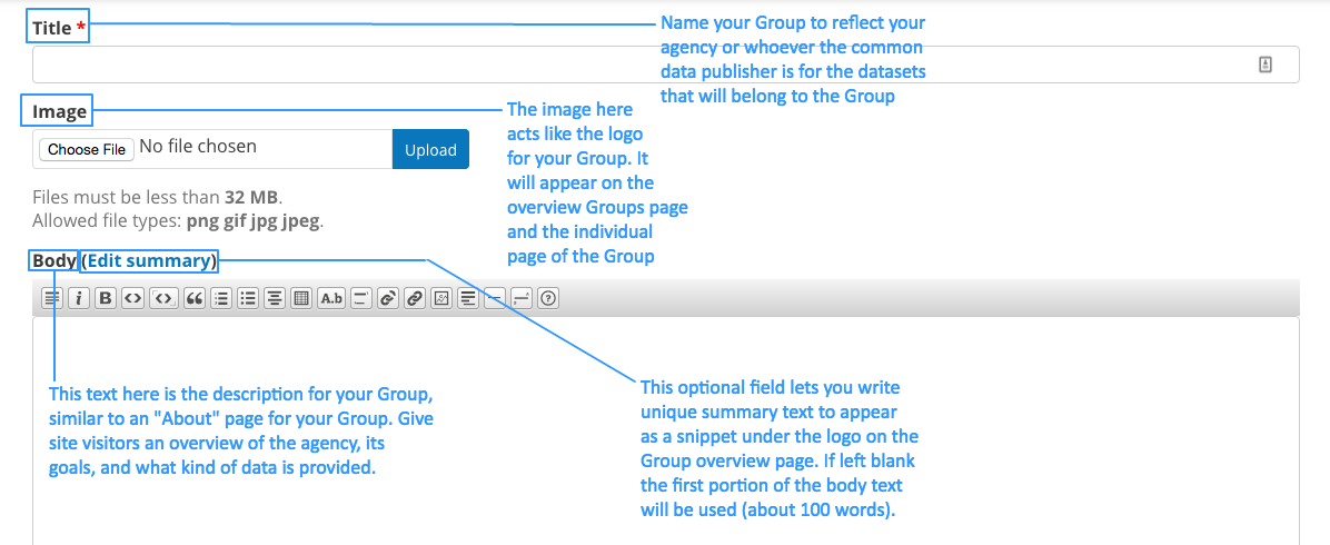
- Title: Name your Group to reflect the agency or whoever the common data publisher is for the datasets that will belong to the Group.
- Image: The image here acts like the logo for your Group. It appears on the overview Groups page as well as the individual page of the Group itself. It’s best to choose a square image to fit the dimensions of the thumbnail. Whether you choose an image, a logo, or an icon you can use any image that meets the size and file type requirements. As a Site Manager, you may want to add generic icons to the Groups you add if a current logo is unavailable.
- Body text: This text is the full description for your Group similar to an About page. The description includes details about the agency, its goals, and information about the data it publishes. While you want to include all the relevant information of the Group, the best descriptions are 1-2 paragraphs long and include a link to the agency’s main web page for more details.
- Summary text: You can use the Summary to create unique text for your Group. This text appears as a snippet under the Group image on the Group overview page. If left blank the first portion of the body text will be used (about 100 words). Including a summary can be useful in adding more key search terms or using a different tone to intrigue site visitors to learn more.
Adding Datasets to a Group
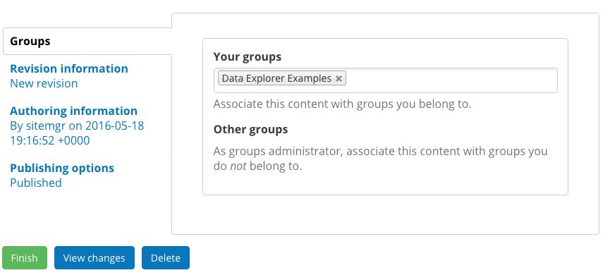
Once you’ve added a new Group, you can assign Datasets (and their Resources) to that Group. Adding a Dataset to a Group is part of the content creation process when adding a new Dataset. The final step in creating any piece of content is using the submenu at the bottom of the form to add the final administrative data to the content. In the case of Datasets that includes adding Datasets to Groups.
When adding a Dataset to a Group, users can add a Dataset to as many Groups as there are on the site. Your groups are Groups that the user authoring the content belongs to, and Other groups are all the Groups of which a user is not a member. All users must belong to at least one Group to have the Groups menu item available to them.
When a Dataset is added to a Group, it will be included on the Group’s home page and may be edited by the Administrator members of a Group. As a best practice, users should only add Datasets to Groups that they are a member. Certain users won’t be able to access their own content if they assign it to a Group that they do not belong to.

Adding members to a Group
Groups have members, who must be first approved, and members have different roles in the Group. A user’s membership status affects how they can interact with the Group. As a Site Manager, you can add members to a Group and give members different roles.
I added my content, where did it go?
You added new content, filled out the fields, included all the details, and then hit the Save button. Now what?
Regardless of the type, once you click on the Save button you’ll next see a preview of how your content looks. Keep in mind that once content is saved (and if it has a published status) it is live on your DKAN site. That means the content is visible to the public. Most users can only save their content and have it directly published. Only Site Managers can add content in an unpublished state. The Preview screen shows you how the content will look to site visitors, so that you can make any final quick edits before moving on.
In the image below, you can see that the content is on the View screen and the content has just been created. This is how the Data Story will appear to a general site visitor (without the ability to edit, of course). At this point, you can get a sense of the appearance and use the In-place Editor to make any final changes.
Manage existing content: Once content is saved it is published and can be managed as existing content.